Prahok
Disciplines
Brand Discovery
Identity Design
Prahok is an agency focused on work management solutions based in Philadelphia. The name Prahok comes from a fermented fish paste used in Cambodian cuisine as a seasoning or a condiment to enhance the flavor of other dishes. This is a metaphor for the work the agency does, which is to help its clients optimize workflow and maximize productivity through consultation for process needs and tools like Jira, Confluence, Salesforce, and more.
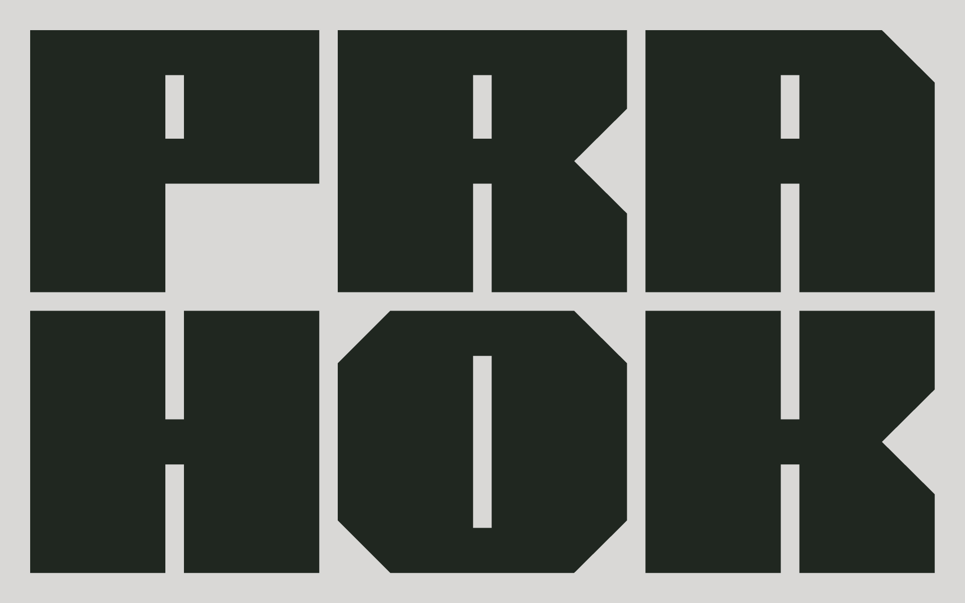
The previous logo adopted a red square paired with a simple rectangle-based logotype. The new identity is an evolution of the previous logo, stripping away the symbol, we center on the idea of flexibility, structure, and functionality.
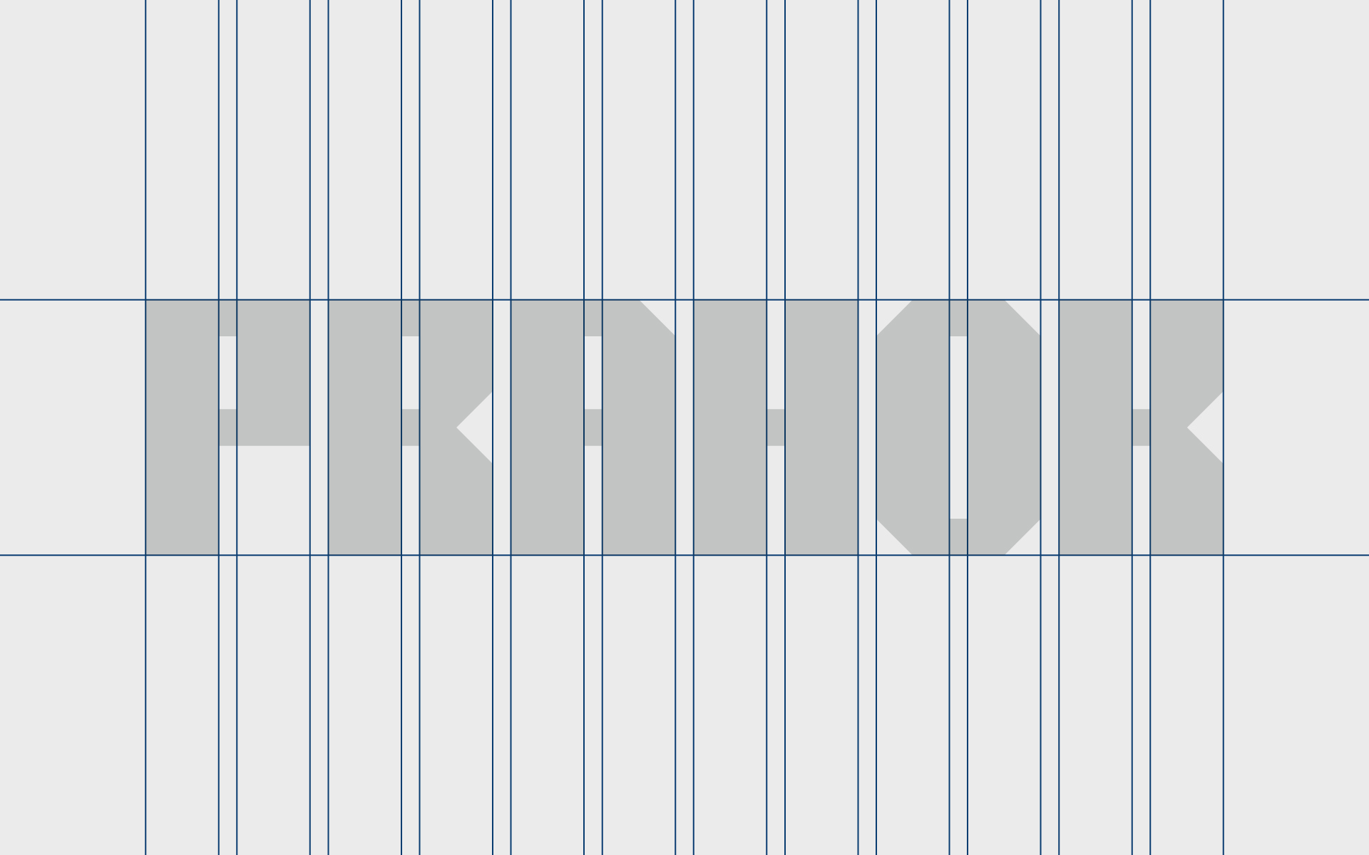
The new custom variable logotype can morph to fit different aspect ratios and sizes according to the usage needs, it can also act as a guide to generate a 12 and 6-column grid system to help layout information, enabling the brand to be more efficient and effective when creating its collaterals.
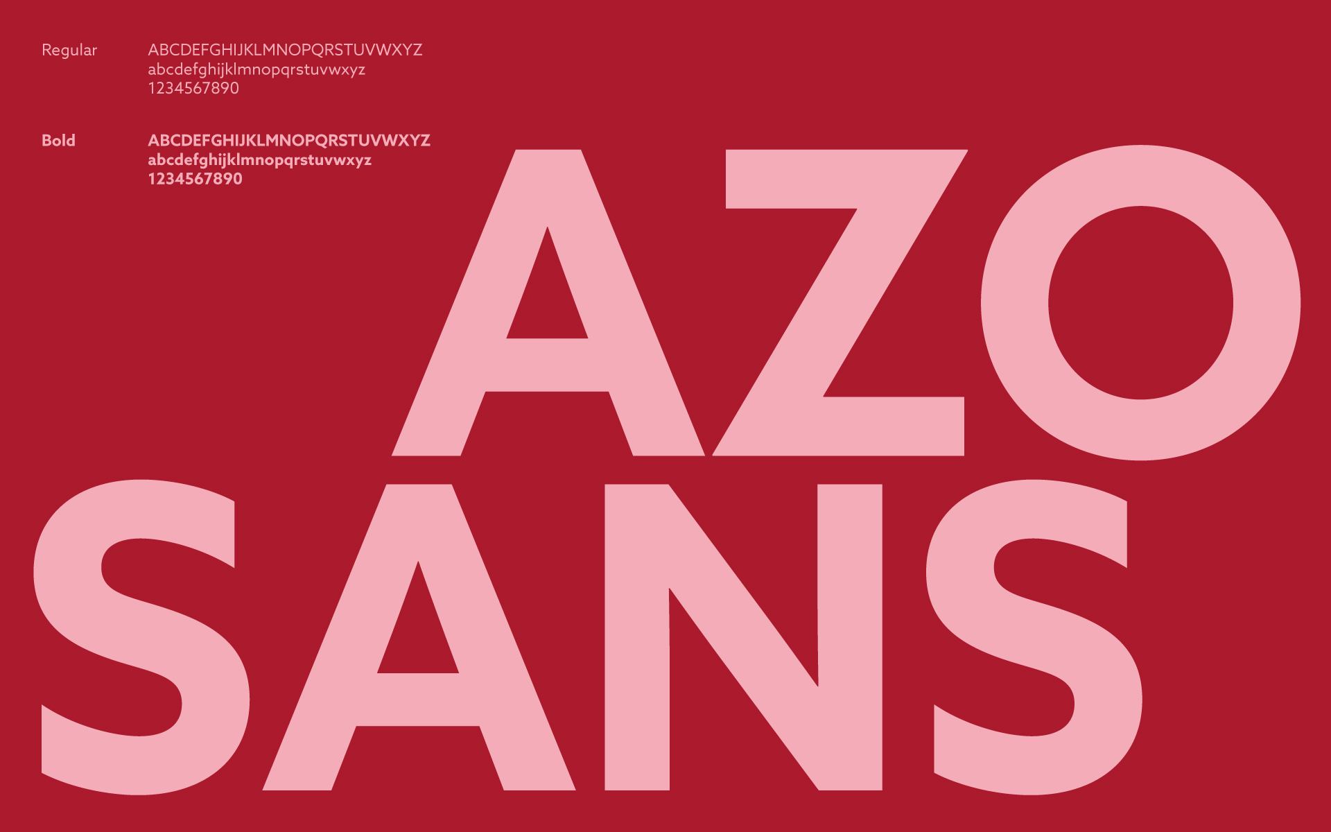
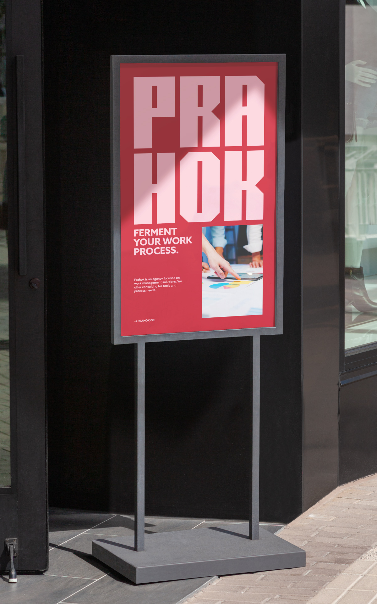
Azo Sans was chosen to be the brand's typography, its simplified geometric features complement the logotype's modularity. When combined with the expanded color palette the identity system becomes more than just visual elements, they become a functional fixture for the brand and help highlight its flexible approach to creating work management solutions.








Work with us
[email protected]
+855 (0) 76 978 8988
Address
#299, 1F-09 Raintree, Ang
Doung, Phnom Penh, Cambodia