PlerngKob
Disciplines
Brand Discovery
Identity Design
Brand Guidelines
PlerngKob which translates to "Sacred Fire" is Cambodia's leading creative powerhouse, the company operates as a record label, talent agency, art & cultural festival innovator, event management, and film production company. Before PlerngKob's conception, the team behind the brand started an arts and culture festival named "BonnPhum" which would take place once a year before Khmer New Year. The festival quickly grew to be a popular fixture in Cambodia's emerging pop culture scene and helped introduce a younger generation to traditional Khmer games and cultural practices. Due to the success and experience of BonnPhum, the team would eventually establish PlerngKob as a business to help manage the festival and offer creative services within the music, film, and social media space.
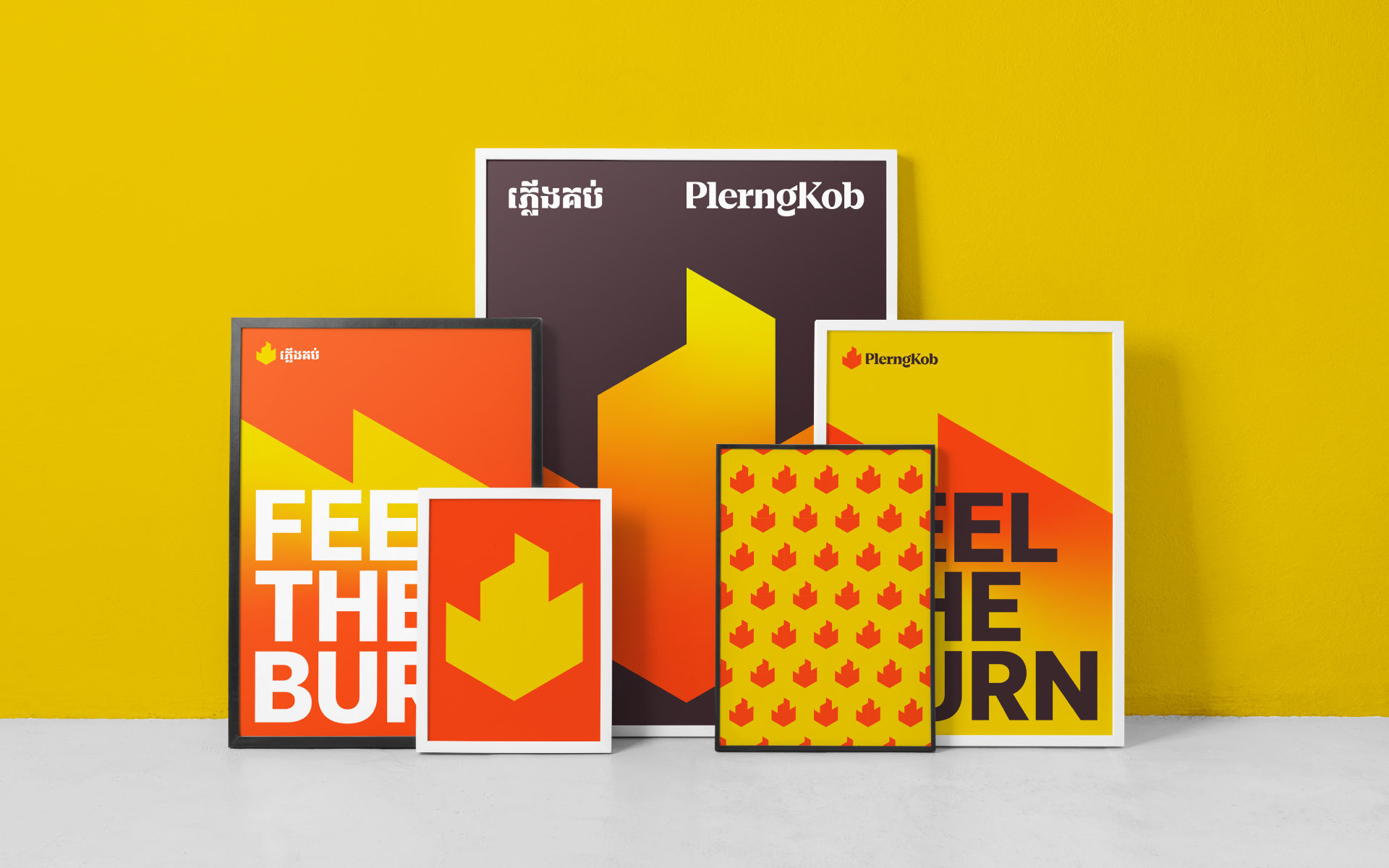
PlerngKob didn't have a strong brand presence, and because BonnPhum was created first and already had a significant following, it led to the misconception that PlerngKob was just a sub-brand under the festival. We were approached to redesign PlerngKob's identity to better reflect its position within its brand architecture while also enabling it to be more relevant to the diverse touchpoints it deploys.
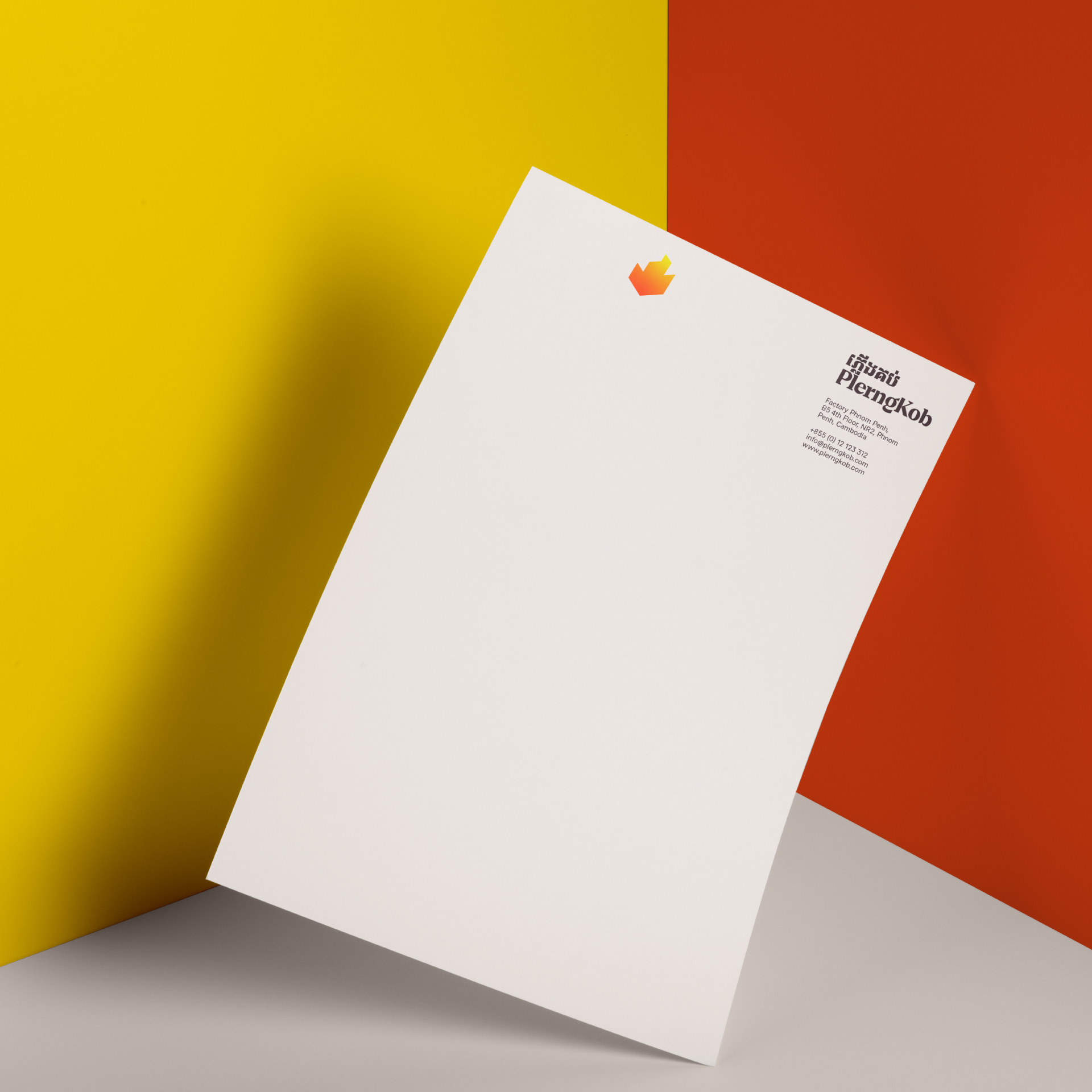
The previous logo adopted a very common approach to how a fire is drawn within Cambodian culture, this proved to be a disadvantage since there are companies within the same industry using this style of symbol already within the country. We wanted to steer clear of any cliches that are often found when adopting Khmer visuals within logos. Going through a Cambodian Ornament design book we discovered that all traditional ornament designs are heavily based on basic geometry. This justified us to take a more timeless approach to the new identity without compromising the company's connection to traditional Cambodian arts.
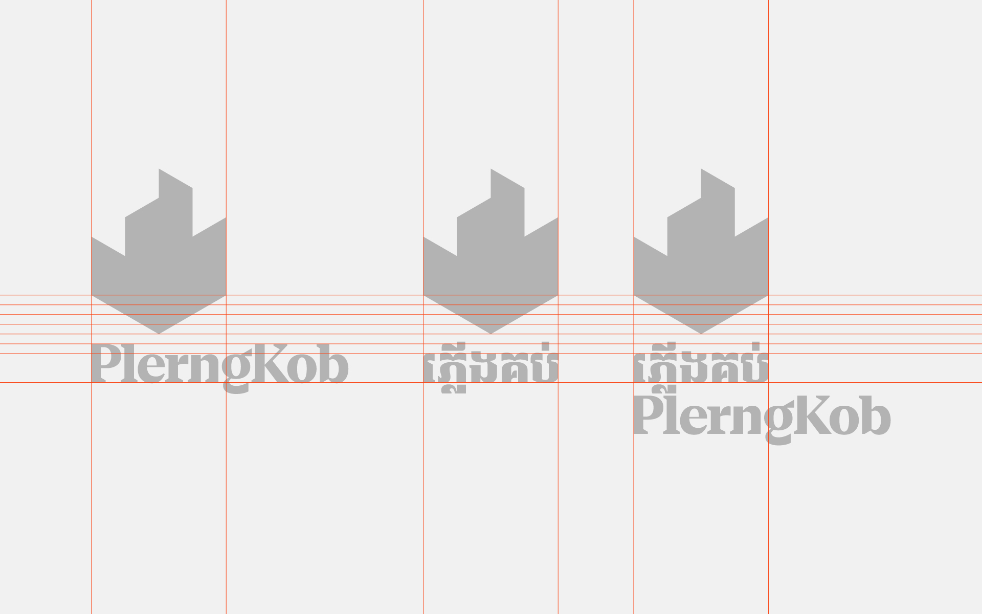
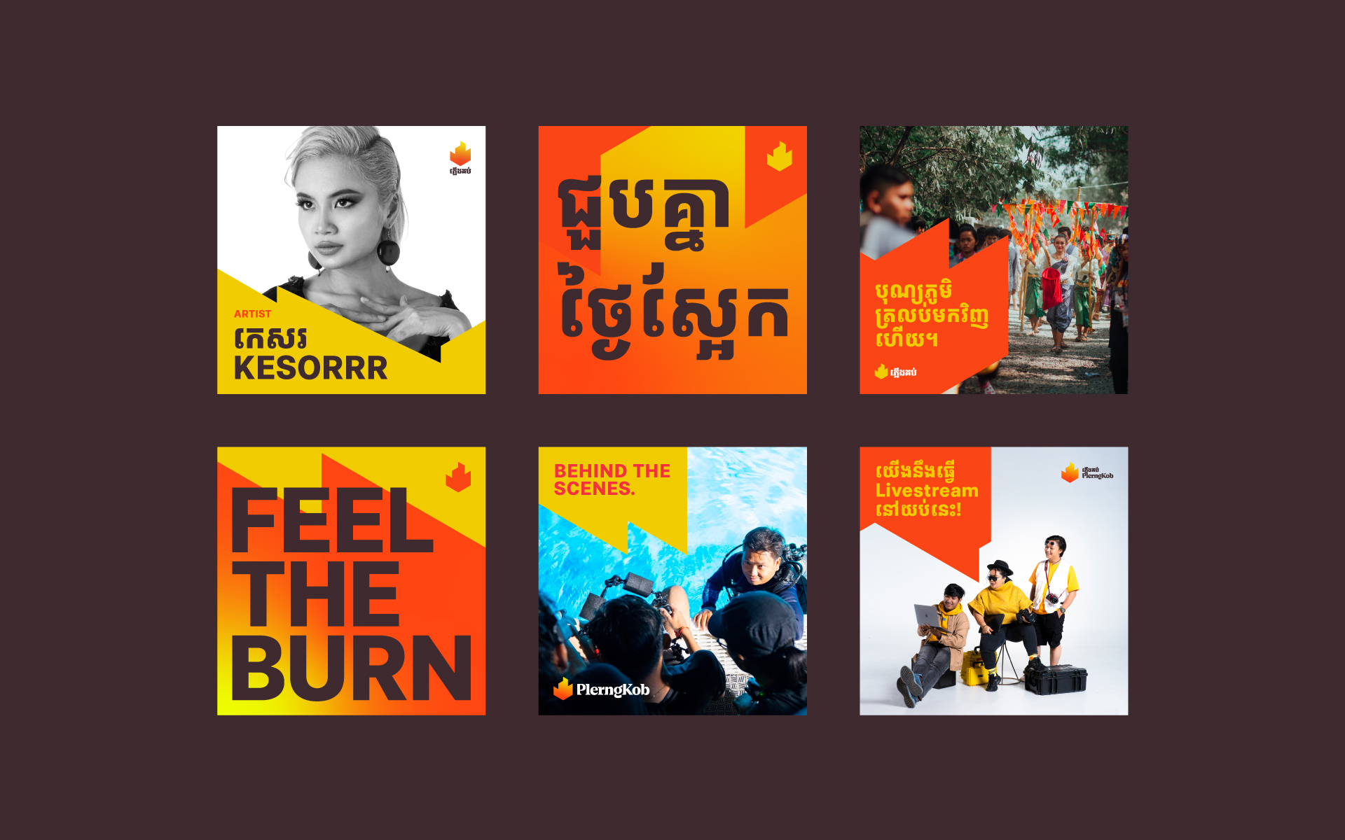
The new symbol was constructed based on an isometric grid, which uses a 30-degree angle from the vertical axes. We also introduced a new color system, typography system, and brand guidelines. The isometric grid can also be used as a foundation to create strikingly simple communication materials for both print and digital further making the identity more versatile.


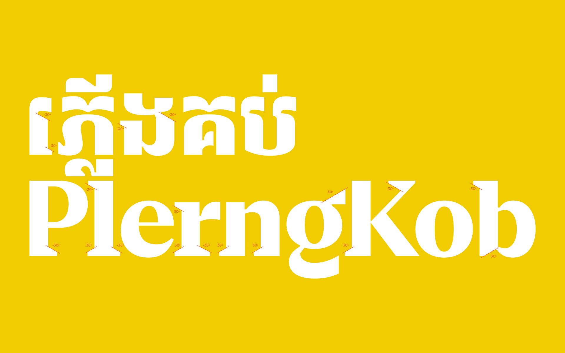
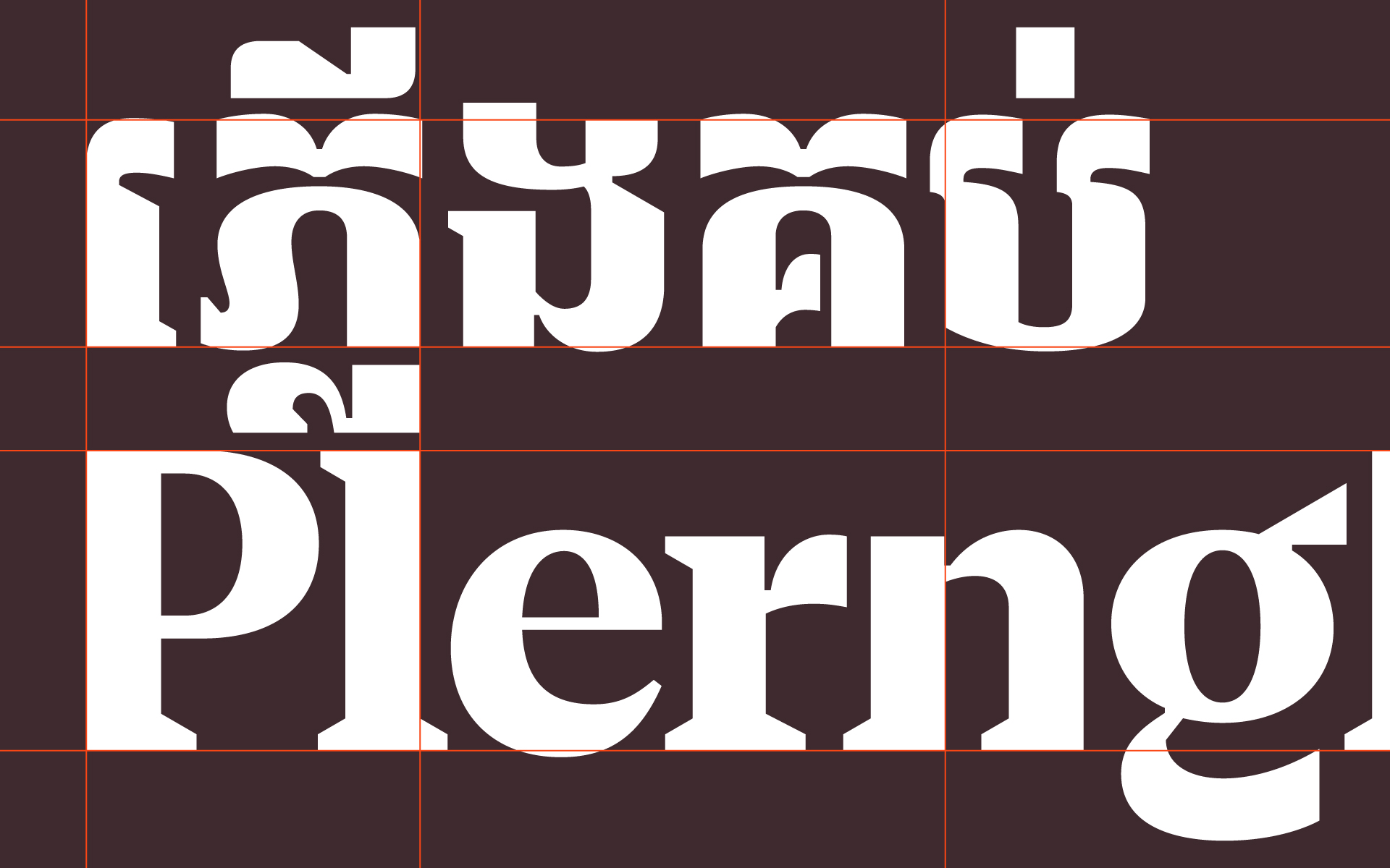
The new logotypes also share the same 30-degree angle as the symbol to further harmonize both elements. Another unique feature is that when stacked on top of each other, the Khmer and Latin create moments of alignment that are not found in any other typeface.


Work with us
[email protected]
+855 (0) 76 978 8988
Address
#299, 1F-09 Raintree, Ang
Doung, Phnom Penh, Cambodia