Google Sans KH
Disciplines
Type Design
Type Engineering
In 2015 Google initiated a rebrand which brought us the now familiar geometric Google logotype. Along with the new logotype, they also introduced a custom typeface named "Product Sans" to help align all the different products under the brand to the then-new colorful geometric design system.
Over the years, the typeface saw some changes, the most notable being the expansion into a display and text variant and a name change to "Google Sans".
In 2020, we were tasked to help adapt Google Sans to Khmer, this was part of a global effort to make the Google brand more inclusive and accessible to everyone everywhere. Like the Latin, Google Sans Khmer needed to support a wide variety of usage cases, from big catchy headers to smaller informative text.
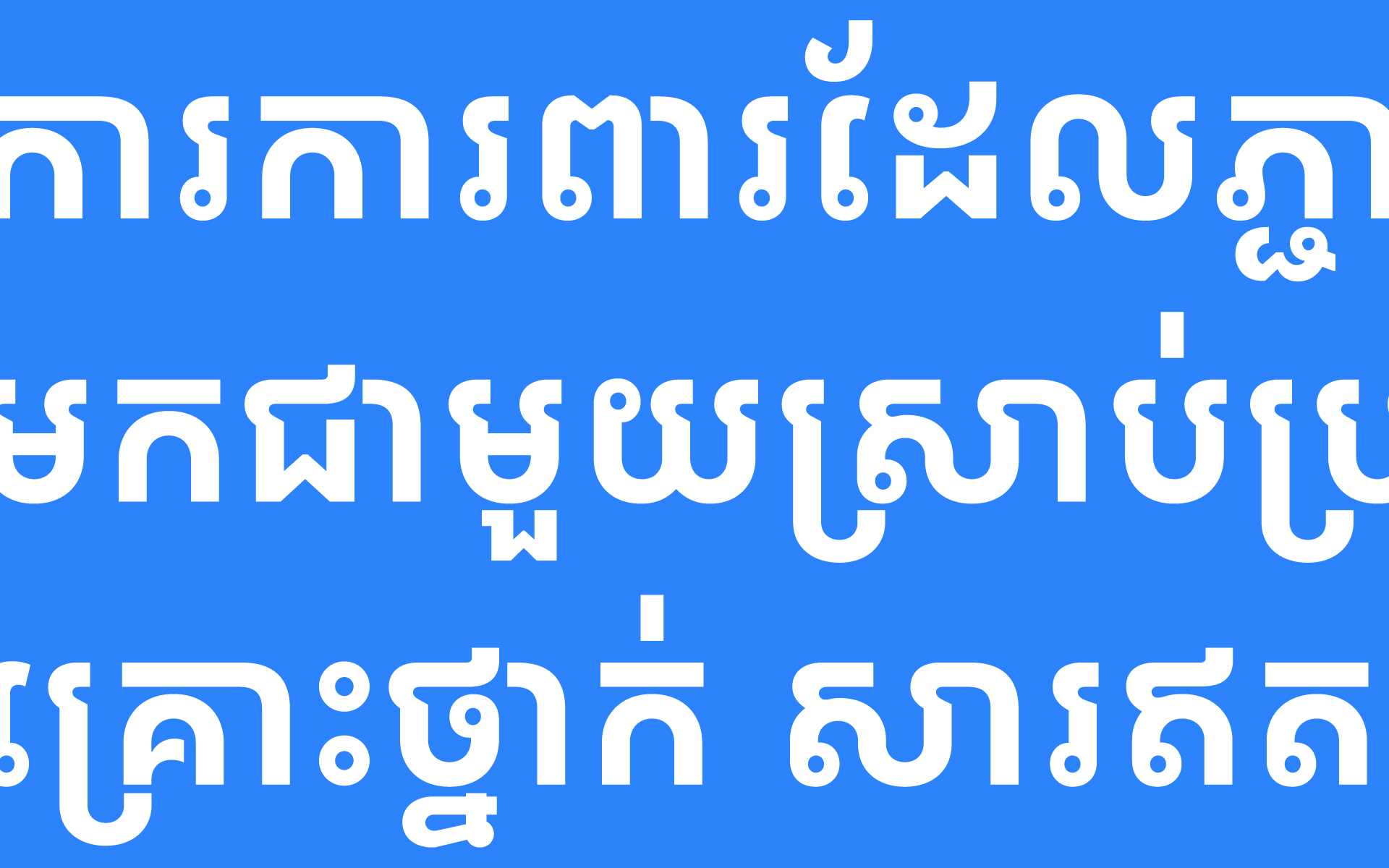
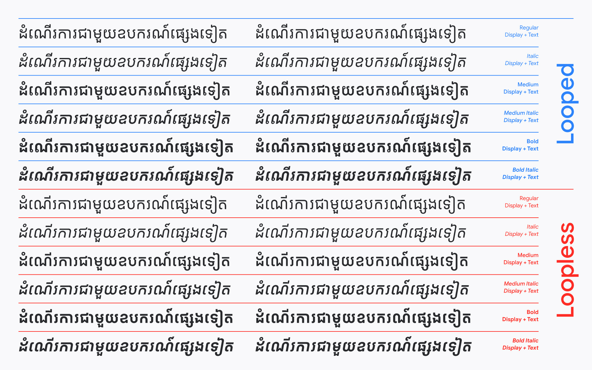
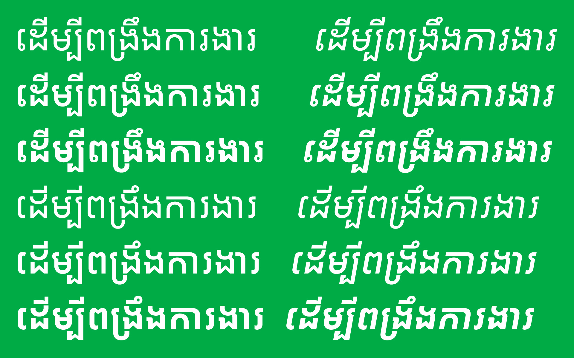
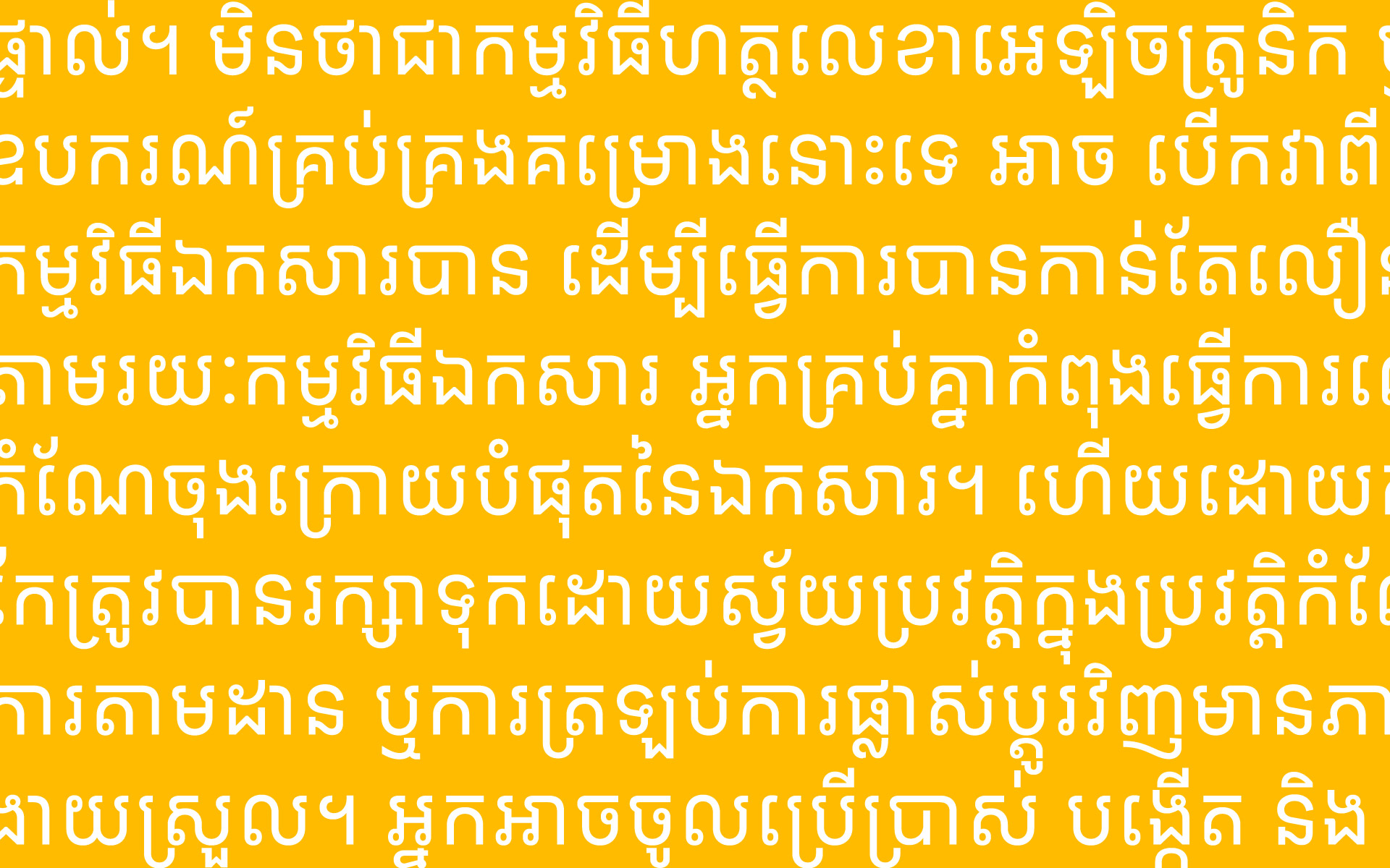
Working closely with the Google design team as part of the Cadson Demak team, we created 2 main cuts of Google Sans Khmer, looped and loopless. Both of these cuts are split into 2 variants as well, display and text. Italics were also created for all the variations.
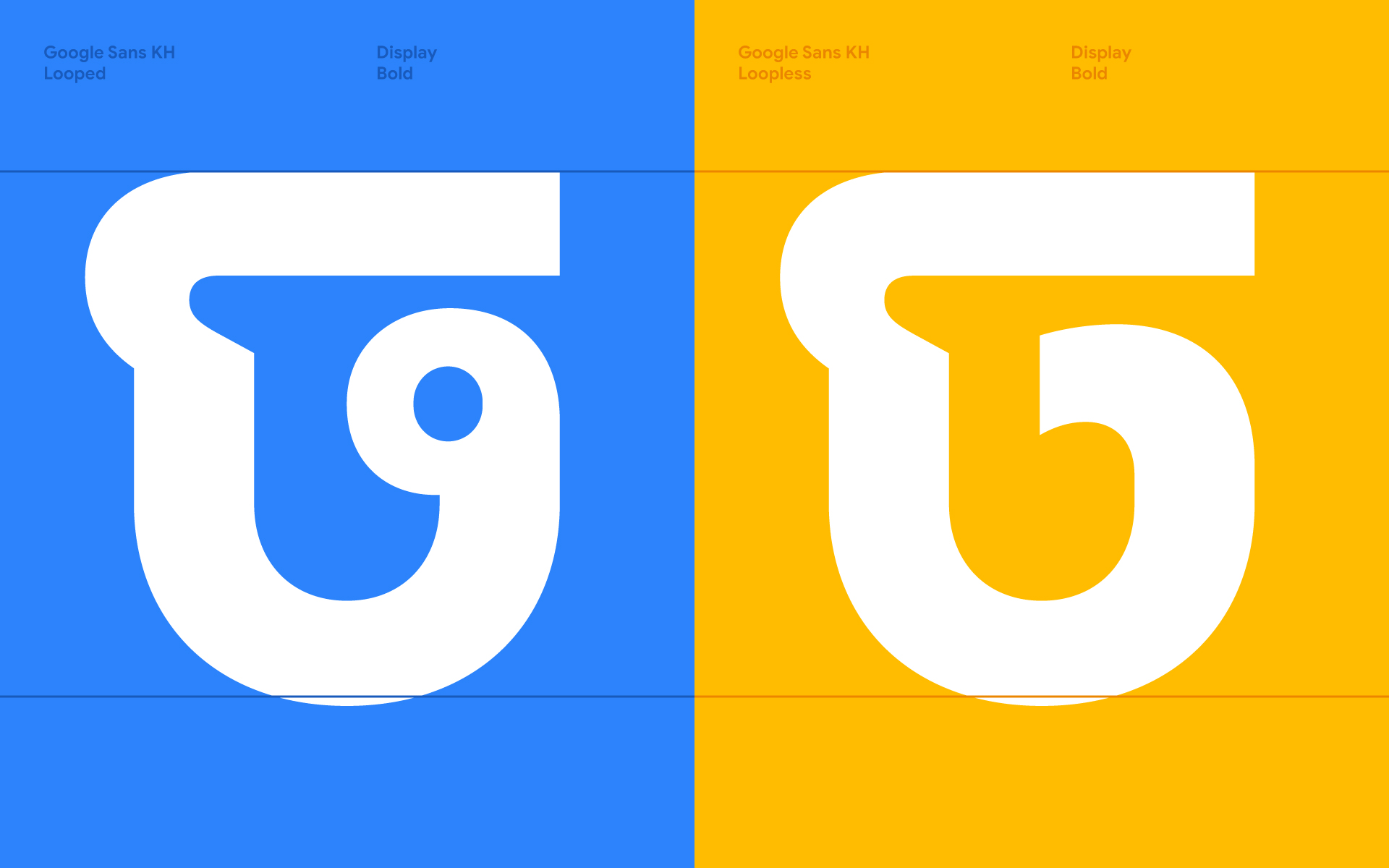
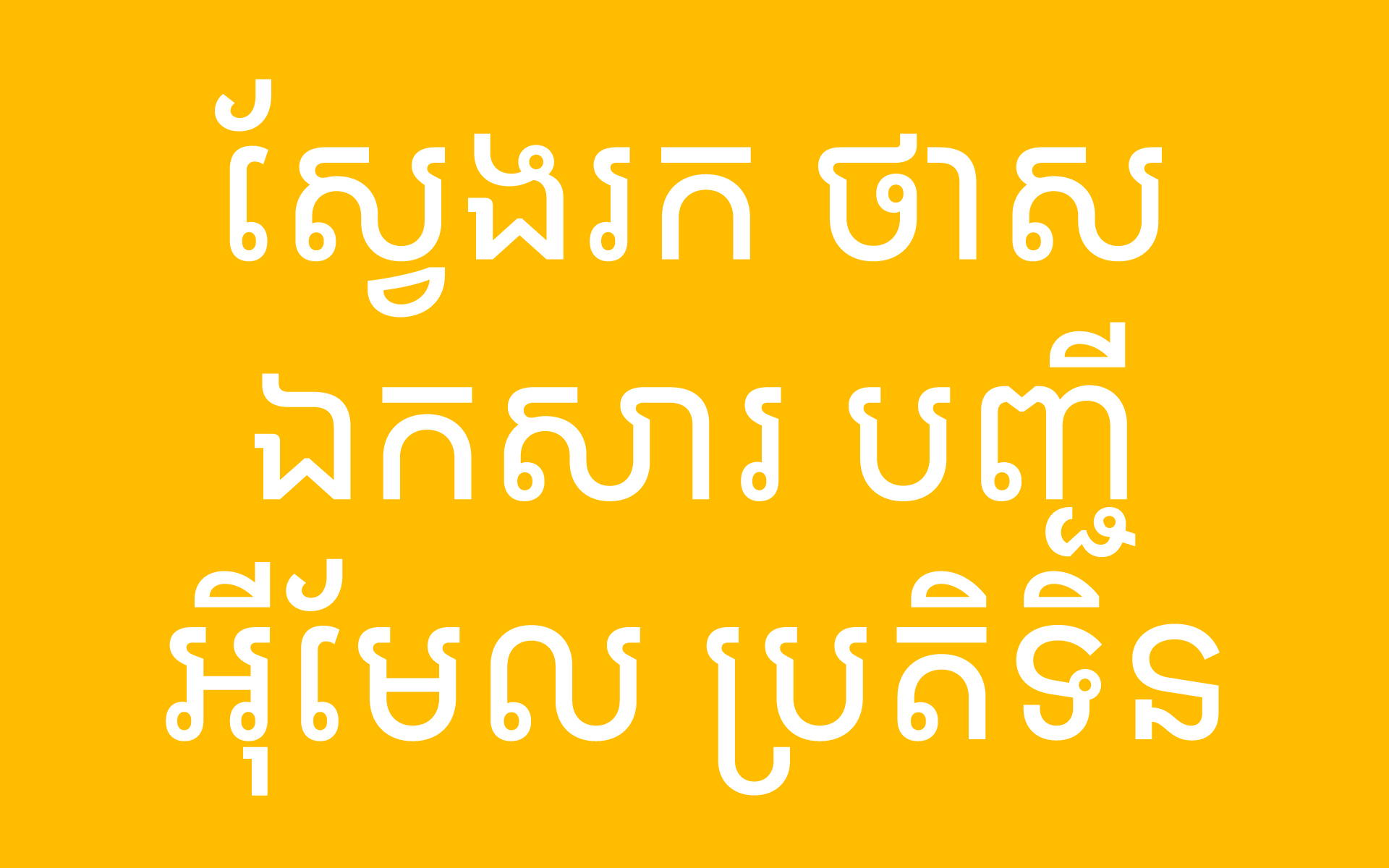
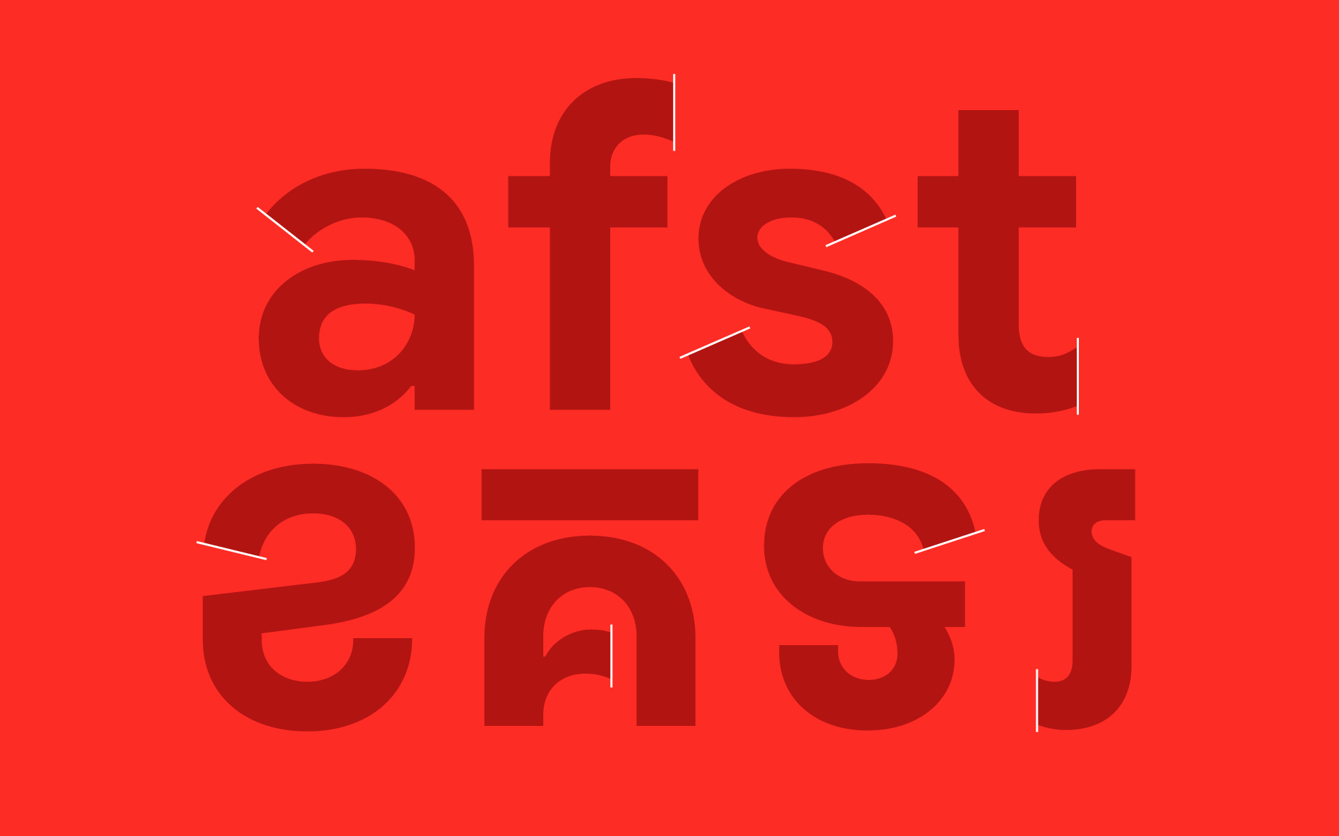
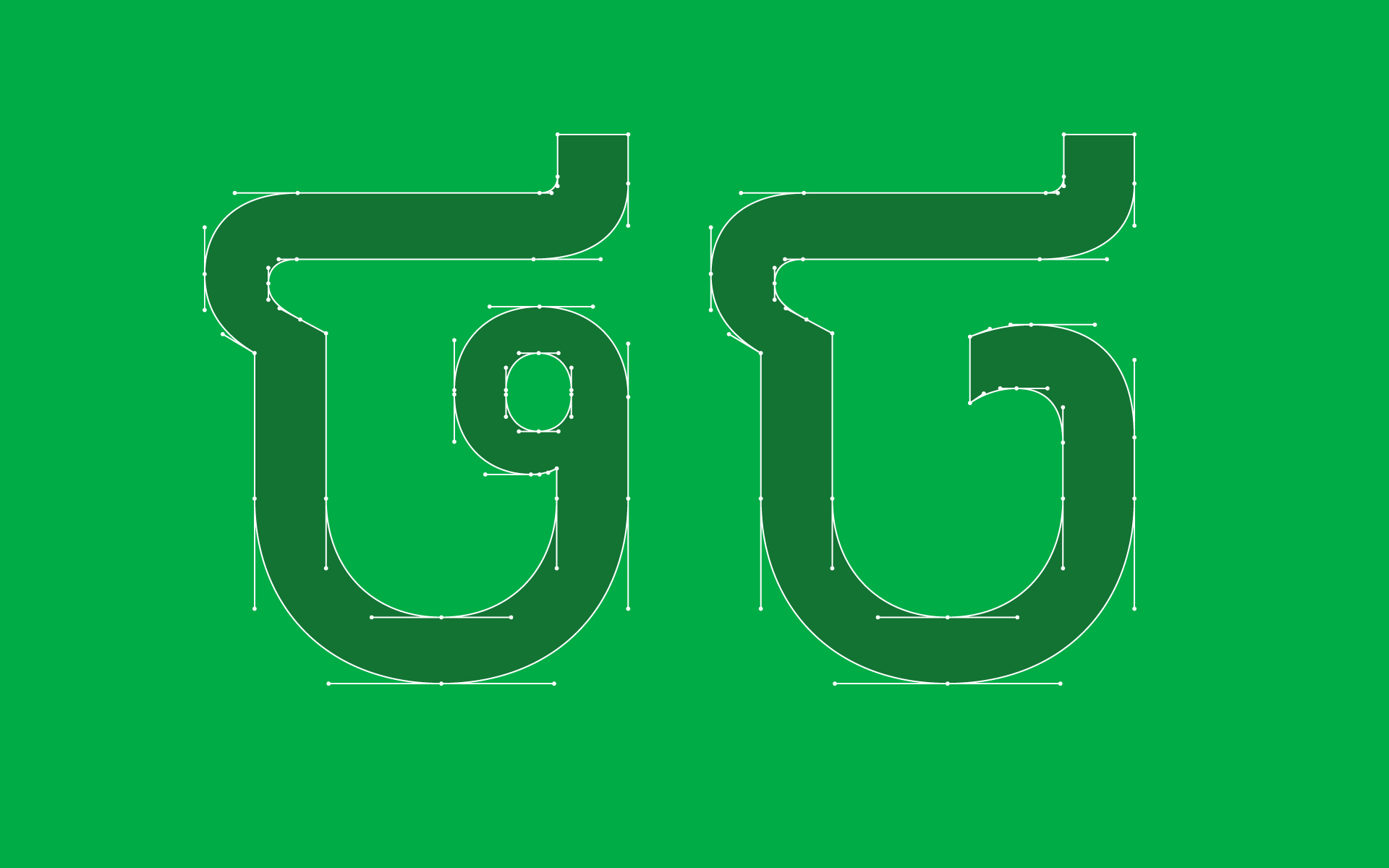
While the Khmer letterforms do follow the same geometric design language as the Latin, certain adjustments had to be made to ensure the letterforms are optically geometric rather than mathematically geometric. The loops for example are not perfect circles, they're more of an oval shape. On the loopless version, the Khmer adopts vertical cut terminals from the "f" and "t". Google Sans Khmer comes in 3 weights, regular, medium, and Bold.

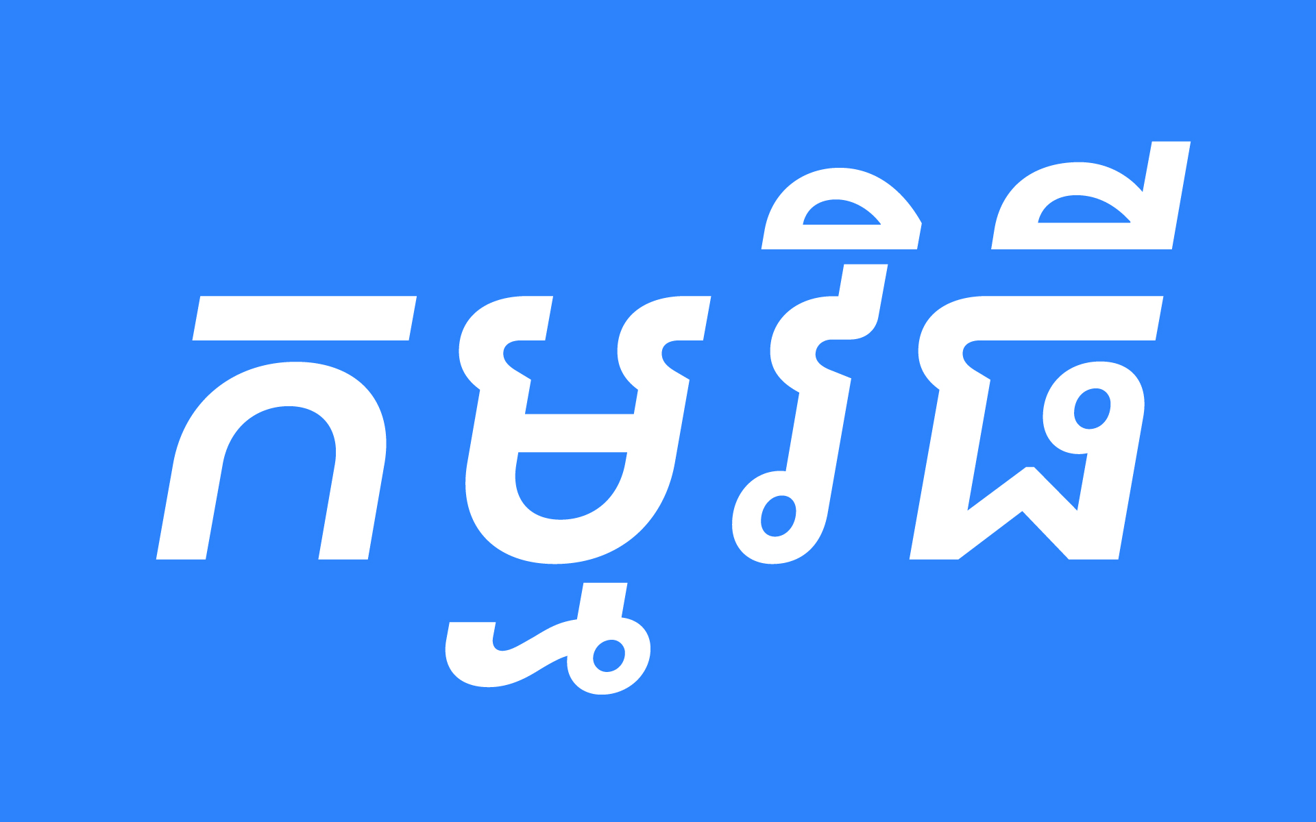

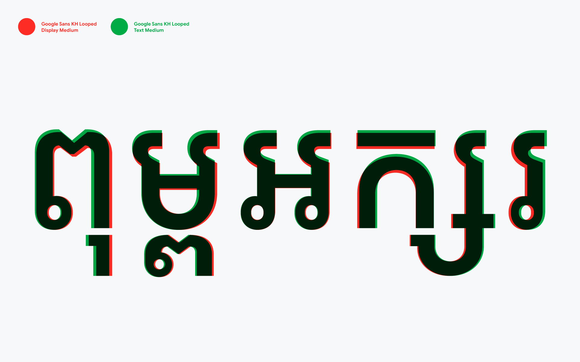
The text version of Google Sans KH features a taller height and bigger counters. The terminals were adjusted to keep them optically the same at smaller sizes.






Work with us
[email protected]
+855 (0) 76 978 8988
Address
#299, 1F-09 Raintree, Ang
Doung, Phnom Penh, Cambodia